Tutorial: Making Links in Content Management Systems

a.i. generative art of a glowing chain link

When working on the web as a website content administrator, you’ll probably use a content management system (CMS) or a newsletter automation system to create and update your content. Each system handles the creation of links differently. Nearly all WYSIWYG editors use the chain icon to indicate a ‘link’, however. (That’s “what you see is what you get” and is a common acronym from web-two, when anybody with internet could suddenly be a content creator.)

And you’ll always need to make links!

What types of links are there?

Internal = Relative path.  If you use the CMS’s internal method of finding a page within your own website; it usually starts with “/”, that’s a relative link. It’s ‘relative’ to the root domain.

External = Absolute path. When you go to the address bar of the browser and copy the entire address there and use the full URL in your link, that’s an absolute link.

Mail. Many CMS solutions have a special menu item for you to create an email link. Some do not. If you are trying to link an email address, and there isn’t a button there that says “email” you may simply need to know that you need to type in “mailto:” and then the full email address. Always test mail links after you publish the page to see if it opens an Outlook compose window, or at least offers to choose an email client for you. More about mailto links from CSS Tricks.

Document. You can’t link to a document that lives on your computer. It must have a URL so that your visitors can also access that document. Some systems require you to first upload to a media library, then highlight the link text and point to the new document. Some allow you to skip that extra step and combine uploading and linking to a document.

In regards to your document filenames, try and remember to change spaces to hyphens and remove extra periods or parentheses or the ampersand from anything you’re going to upload into a CMS.

Anchor Links. These are also called jumplinks. They take you to a different point on the same page. You first need access to the code view so you can insert an ID attribute. If you can’t get to the code view, try and see if your system has an anchor link option. For instance, here is a Shopify anchor link tutorial. Also, here is WordPress documentation for how to make an anchor link. (I found this after I recorded the video. I opened the Block Advanced pane in the post editor and found the link to this documentation there. You can pre-set the HTML Anchor on the headline of your choice, and then when you create the jumplink, the WYSIWYG will offer the ID tag for you to choose.)

The ever-helpful “Back to Top” links on long articles are anchor links. There would be an ID called “#top” set near the H1 on the page content, then you could add your own back to top links if the article is getting long. Like this one. But I’m not going to.

Telephone Links. These are usually the click-to-call buttons that work on smartphones. To make a link that places a call, you’ll need to start it with “tel:+1” and the phone number.

Parts of a link

The words you highlight to turn into a hyperlink are called ‘link text.’ The place where you point the link to is called the ‘link destination.’ Your link text can span multiple words.

If you are making a button, then the words that appear on the button are called the ‘button label.’

When making a link in a paragraph near the end of a sentence: do not include the final punctuation in the link text.

When making links in list items, be careful when selecting link text words.

Mechanics of Making Links

The icon of a link represents a chain, such as a chain to hold the gate on a chain link fence closed. The line inside of two horseshoe-shaped ovals represents the third chain that is turned 90 degrees. It’s an early-days metaphor still in action.

Google Icons (Material Design)

Flat Icons – Link

The mechanics: Using a computer mouse or trackpad, you can click at the last character of the link text and then drag through all the words backwards, and let go at the first character. I find this reduces my chances of accidentally hyperlinking the space after the last word of the link text. Once the correct link text is selected, click the chain icon in the WYSIWYG.

Setting the link destination:

If you were going to make a hyperlink to an offsite URL, load that URL into your clipboard before selecting the link text. Then, you won’t make a mistake in the time between seeing the empty field to paste the link and realizing you don’t have that link already copied into your clipboard. If you are going to create a relative link to another page or document in your own website, make note of what that content is called inside your system, so you can increase your chances of finding the correct page with the automatic content search tool.

Making sure it worked: In some systems, you’ll need to use the mouse to select the content offered by the link widget. Or, you could click the enter key if you have one, and if not, try the return key. Check if there is a save button or not. I think the newer content management link widgets are counting the selection of the internal content or external link AS the enter key, so they don’t display an OK or SAVE button.

Once your cursor is back in the page content, do you see the underline signifier on the link text you had highlighted? If so, save your edits. In content management systems, you’ll often be saving things that go live to the public right away. Your cadence for checking if you did it right will change based on how much you still need to edit. At the end of your editing, in a new browser tab, view that page like the public would. Then click that link you edited or created. Does it do what you expected? If you were linking a spreadsheet, check your downloads folder to see if you received a new copy. And so on. Continue proofing until it all behaves correctly. You can work between the two tabs to save time. One tab for the editing view, the other for the proofing view. Hit shift-refresh on the browser to pull down the newest changes on the proofing page between edits.

When fixing a broken link, what considerations are there?

If you use a broken link report service or a single-use page crawler, you’ll need to learn about error codes, what they mean, and how to know when you should break a broken link or find a replacement. Understanding the difference between relative and absolute links will come in handy if you’ve suddenly got a lot of broken links inside your site after renaming headlines or directories. In this case, you’ll also want to check whether the broken link page is published or unpublished.

Automated link checker

Validate your page

What is that error code?

Let’s say you need to point an existing link to a different page, and the link text is five words long. How would you do it? Would you be able to tell if you made an error? I have coached scores of new content managers how to edit links, and people go about it in different ways that surprise me.

In a CMS, you usually have access to a ‘break link’ icon, and it may look like a chain breaking. To ensure that all parts of the existing hyperlink get erased, place the cursor in the link but don’t highlight. Then choose the break link button. Then go ahead and highlight the link text and make the new link from scratch. You could also edit the existing link instead of deleting it first.

What is Empty Link Text? If your link report or accessibility report is saying your page has empty link text, it is most likely due to a copy and paste or a delete error. Sometimes when deleting link text, there is a space leftover that still has a hyperlink in it.

What’s the difference between a link and a button?

A button is hyperlinked and has a <button> tag underneath it in the code. A link is hyperlinked and can be placed in a paragraph tag, a list item tag, or a div tag, to name a few. The history behind choosing whether to make a link or a button is rife with lively debate. Usually a button is reserved for a desired user action or a user decision, such as downloading a report or signing up to an email list.

The controversy behind the link or button debate goes pretty far back, way back… Back to when we didn’t have CSS stylesheets and we didn’t have a button tag within semantic HTML. Web devs had to get creative to get a link to look like a button. So, now we have links that look like buttons but are not semantic buttons, and we have navigation elements that look like buttons but are links in the code. This causes accessibility problems, and if you really want to, take a deeper dive in the resources here:

W3 Schools article: Accessibility Buttons & Links

CSS Tricks: Complete Guide to Links and Buttons
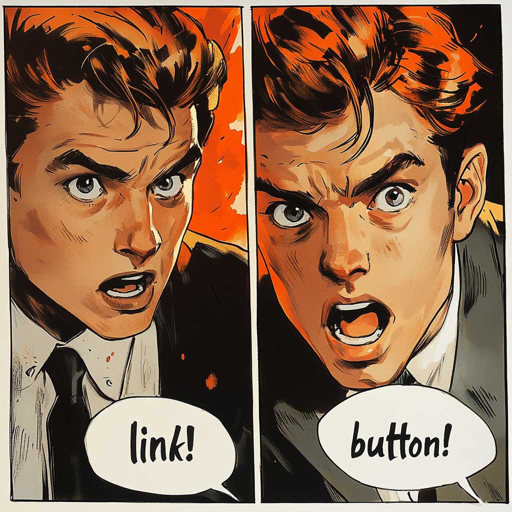
a.i. generative art in comic book style. watercolor painting of one boy shouting link! and the other boy shouting button!

Etiquette: We should stay away from placing links in headlines like H2 or H3 tags. There are exceptions to this, however, such as a blog feed or news feed page, where the entire headline of the article is automatically turned into a link to the full article. We should not include the period at the end of a sentence in the link text. When making links inside quotes, keep the linked text inside the quotation marks. We should refrain from making more than one link to a destination using different link text. And, for the love of links, stop using “click here” as the only link text. The link text should give a clue as to where the user will land when they click.

Drama? What about opening links in new tabs?

Yes, there is a lot of spirited debate over whether to open a link in a new tab or not. In most WYSIWYG editors today, there will be a toggle button for you to choose whether to open link in new tab. Try and be consistent with your choices.

Links to other pages on your website do not need to be opened in a new tab. They should consistently remain in the same tab.

The controversy lies in how to handle offsite links. Do we open those in new tabs so users will have your site still there if they close the new page? Do we open those in the same tab so users will have their favorite browser button enabled: the BACK button?

I’m in favor of just being consistent.

Topics about links I didn’t have time to discuss

That sums up my Links 101 article and companion video! However, I didn’t talk about styling links, or SEO, or keyword stuffing of links, or the UX study of effective link and button text, or how users of assistive technology experience links, or cloud sharing links, et. cetera.

Also, a little out of scope for this article and video was the topic of linked images. Yes, people have been placing links on image tags for a long time. There is a lot to unpack about this in terms of usability and accessibility. I found WebAim published an article of quick tips about accessibility, and Tip #11 is:

“When creating an image link, the image alternative text must present the content of the image AND describe the destination of the link. Make sure that the image’s alt text would be sufficient if it were the text in a regular link.” WebAim Blog Oct. 2024

Linking is the mainstay of the internet and there is so much to talk about from many different angles!

The Birth of the Web, Tim Berners Lee

What usability considerations are needed for MS?

I came up with a question for Chat GPT: “what are some considerations UX designers can plan for to help people with Multiple Sclerosis (MS) have an easier time with websites? What do users with MS need, in terms of accessible design?”

In the video below, I talk through the various considerations that were listed.

16 minute video recording – starts at :40 second mark

Designing websites with accessibility considerations for individuals with Multiple Sclerosis (MS) involves addressing a range of potential symptoms that could affect their interaction with digital interfaces. MS can cause issues like motor difficulties, visual impairments, cognitive challenges, and fatigue. Here’s an outline of accessibility considerations:

  1. Motor Difficulties
    • Keyboard accessibility
    • Large clickable areas
    • Voice control
    • Sticky keys
  2. Visual Impairments
    • High contrast modes
    • Scalable text
    • Colorblind-friendly design
    • Accessible images
  3. Cognitive Challenges
    • Simplified navigation
    • Plain language
    • Content chunking
    • Consistent layout
    • Error prevention
  4. Fatigue Management
    • Task simplification
    • Save progress
    • Time extensions
    • Auto-save
  5. General Usability
    • Responsive design
    • Minimal use of moving or flashing content
    • Accessible multimedia (videos and audio)
  6. Feedback and Confirmation
    • Clear feedback
    • Confirmation messages

I’ve learned over the years that UX designers tend to say that if we make a digital product more accessible, it improves general usability for everyone.

Empowering Small Business Builders Series: Content Strategy Concepts

colorful stripes

Small business builders, artists, musicians, solopreneurs, take note. Here are some concepts that may help clarify what you need your website to do for you. Content strategy is the plan you make before building your website. You consider search engine optimization (SEO), Usability, and Accessibility. Or at least you should. 😉

SEO means how you place in organic search results, and how you plan to improve your ranking organically through a combination of getting backlinks, making text changes to your web copy, and using paid advertising.

Usability focuses on creating an enjoyable and intuitive user experience for all visitors. Can your audience complete the tasks you’d like them to complete while on your site, such as subscribing to your newsletter, signing up to your course offering, or completing a transaction.

Structured content allows us to write once and publish everywhere. It’s when you mark up your titles, lists, summaries, images and paragraphs so that machines and systems can understand them and display them appropriately.

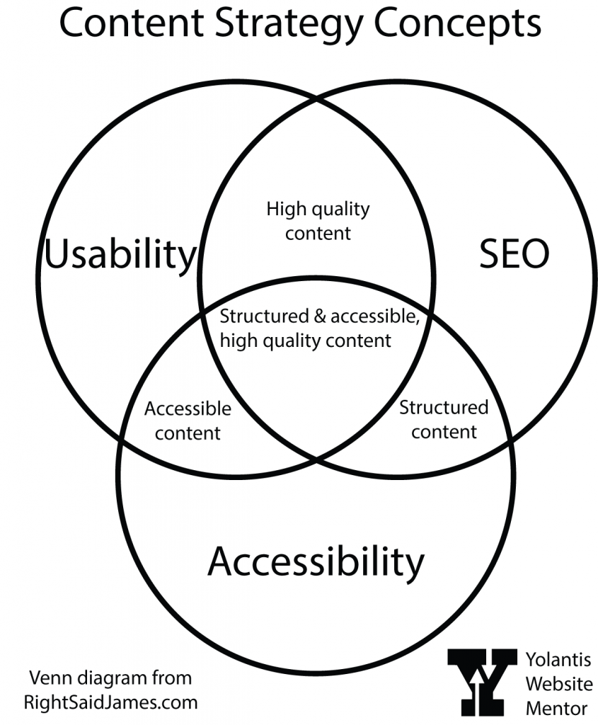
In the following venn diagram, we see that:

  • A combination of good usability and SEO gives high quality content.
  • A combination of good SEO and accessibility will give good structured content and accessible content.
  • A combo of good accessibility and usability gives high quality, accessible content.
  • All three concepts give that sweet spot of structured and accessible, high quality content.
content strategy concepts venn diagram is described in surrounding text.

FAQ

Now, let’s dive into some common questions you might have as you navigate the world of website building.

Question 1: What is web accessibility, and why does it matter for my website?

Web accessibility ensures that your website is usable by everyone, regardless of their abilities. By making your site accessible, you’re not only expanding your audience reach but also embodying inclusivity in action.

Question 2: How can I ensure that the text content on my website is accessible to all users?

One simple way to ensure text accessibility is by using clear and concise language. Break up your content with headings and subheadings, making it easier for visitors to navigate and understand. Remember, simplicity is key!

Question 3: What are the key considerations for making images and graphics accessible?

When adding images and graphics to your website (and also your social media posts), be sure to include descriptive alternative text (alt text). This ensures that visitors using screen readers can fully engage with your visual content.

Question 4: How should I structure headings and subheadings to improve accessibility?

Ah, heading hierarchy—a crucial component of web accessibility! Start with an <h1> tag for your main page title, followed by <h2> tags for major sections, and <h3> tags for sections related to the h2’s above them. This hierarchical structure not only aids in accessibility but also enhances the overall organization of your content. Every content management system has a different look and feel but they all have a way for you to mark your headings in the paragraph dropdown box.

Question 5: What are the best practices for creating accessible links and navigation menus?

When creating links and navigation menus, opt for descriptive link text that clearly conveys the link destination. Additionally, ensure that your navigation menus are structured logically and can be easily accessed via keyboard navigation without the need for a mouse.

Summary

Usability and accessibility are all about making the journey smooth and seamless for every visitor. I hope these answers have shed some light on the path to website content strategy. Remember, you are capable of creating a website that not only looks beautiful but also welcomes visitors of all abilities. Embrace the process, ask questions, and never underestimate your ability to make a positive impact online.

Thank you for joining me on this empowering journey. Until next time, keep shining bright, and remember—the world is waiting to experience the magic of your small business!

Read part 1: Making a Usable and Accessible Website

If you’re visiting from Awedacity, I have an Awedacity HQ Citizen space called Hub Yolantis in OnCyber if you want to take a metaverse tour.

Empowering Small Business Builders Series: Making a Usable and Accessible Website

colorful stripes

Today, we’re going to embark on a journey to learn about making a website for your small business. Whether you’re a seasoned entrepreneur or just starting your small business journey, I’m here to assure you: you’ve got this! 

My name is Yolantis, your website mentor. Not only am I a fine artist, but I’ve been working on websites as a career since 2000, and I’d like to help you understand the things you’ll need to do when it is time to get YOUR small business online. Maybe you’re an artist, or designer, or musician thinking, hey, I really need a website, or, Hey, I haven’t touched my website in months, maybe I should pay more attention to it.

To be clear, I’m not writing this from the viewpoint of a freelance website builder. I’ve already got a job and I don’t have bandwidth to take on all of your web projects. What I want to do is help you improve your website. I’ll explain how later in my series. I have a curriculum about usability and digital accessibility for people who WANT to run their own website. But first I’ll do a quick intro to website strategy concepts.

Ready for a site of your own?

So it’s time to set up the website. Let’s talk about the essential technology needs for having your very own website.

Building a website starts with laying the groundwork, and that means having the right tools and technology at your disposal. Let’s break it down, step by step.

Domain Name

You’ll need a domain name if you want to establish a professional online presence. Think of it as your digital address—a unique identifier that visitors will use to find your website. It’s a purchase that can be standalone or bundled with hosting. You usually buy a domain name for one year, two years, or five years. Choose a name that reflects your brand and resonates with your audience, and isn’t already taken. If you are going to name your business after you get a domain, you can go to a domain name provider to see if it is taken. If you already have a business name but it’s not available as a domain name, the domain provider usually gives you alternatives that will work just as well.

Website Editor

Once you’ve secured your domain name, it’s time to choose a website editor, also known as a content management system (CMS). Whether it’s Squarespace, WordPress, Wix, Hubspot or one of hundreds of other builders out there, there are plenty of user-friendly options to explore. These platforms offer intuitive interfaces and customizable templates, which make website creation easier than starting from scratch. 

Again, if you are a solopreneur trying to do everything yourself, maybe because there isn’t enough income to justify the cost of a website agency, you’ll want to use a service that has website templates available. That way you can make your own edits whenever you need to. If you are at a stage in building your own business where you’re overwhelmed and don’t have the time for website creation or maintenance because you’re busy building your business, please do reach out to a local website & marketing agency. You’ll pay for the privilege, but they should take care of all of that for you.

Security Certificate

Now, here’s a crucial consideration: hosting and security. Ensure that your chosen website host includes a security certificate with your package, or be prepared to purchase one separately. A security certificate encrypts data transmitted between your website and its visitors, providing peace of mind for both you and your audience. Not only that, if your certificate is expired or something went wrong with it, nobody can get to your website.

Hosting

Sometimes hosting comes with the editor, as in the case of Squarespace, Wix, and Hubspot. But if you’re not going with one of those all-in-one service plans, you could choose any hosting company and purchase a WordPress hosting plan and they will install the newest version for you. Or you could look around at popular hosting companies and find out if they have a built-in, proprietary website builder tool. Lots of them do now. When it comes to the cost of website hosting, cheaper isn’t always the way to go. Do your research to find out how responsive their customer service is. Fast and effective customer service ranks higher than a more affordable plan rate.

Website Strategy Concepts

With your domain name registered, CMS and hosting provider selected, and security measures in place, you’re ready to dive into website building. But remember, accessibility and usability are essential components of a successful website, and they go hand in hand with the technology you’ve put in place, so we plan our content next.

Now, let’s talk about two concepts that often seem daunting: accessibility and usability. Accessibility refers to making your website usable for everyone, including those with disabilities. Usability, on the other hand, focuses on creating an enjoyable and intuitive user experience for all visitors. These two concepts go hand in hand. When we prioritize accessibility, we naturally enhance usability, creating a welcoming digital space for all.

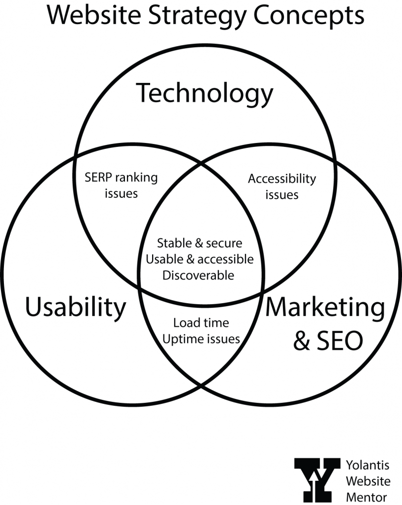
Take a look at this Venn diagram of website strategy concepts. The three main circles are Technology, Marketing & SEO, and Usability. They all work together to help your business be successful. In my diagram, the overlapping areas indicate issues you may face if one of these main things are missing.

  • If you have great technology and marketing but you have a usability problem, then you may end up with accessibility issues.
  • If you have great marketing and usability but your technology has a glitch you may experience long load times or sporadic downtimes, for instance.
  • If your usability and technology are good but the marketing plan isn’t effective, you may end up being low on search results for your keywords or you may even be blocked by Google from showing up in search results.
  • And if you find that sweet spot then your website is secure and stable, usable and accessible, and discoverable. 

Read part two: Content Strategy Concepts.

If you’re visiting from Awedacity, I have an Awedacity HQ Citizen space called Hub Yolantis in OnCyber if you want to take a metaverse tour.

Why ‘Click Here’ is everywhere

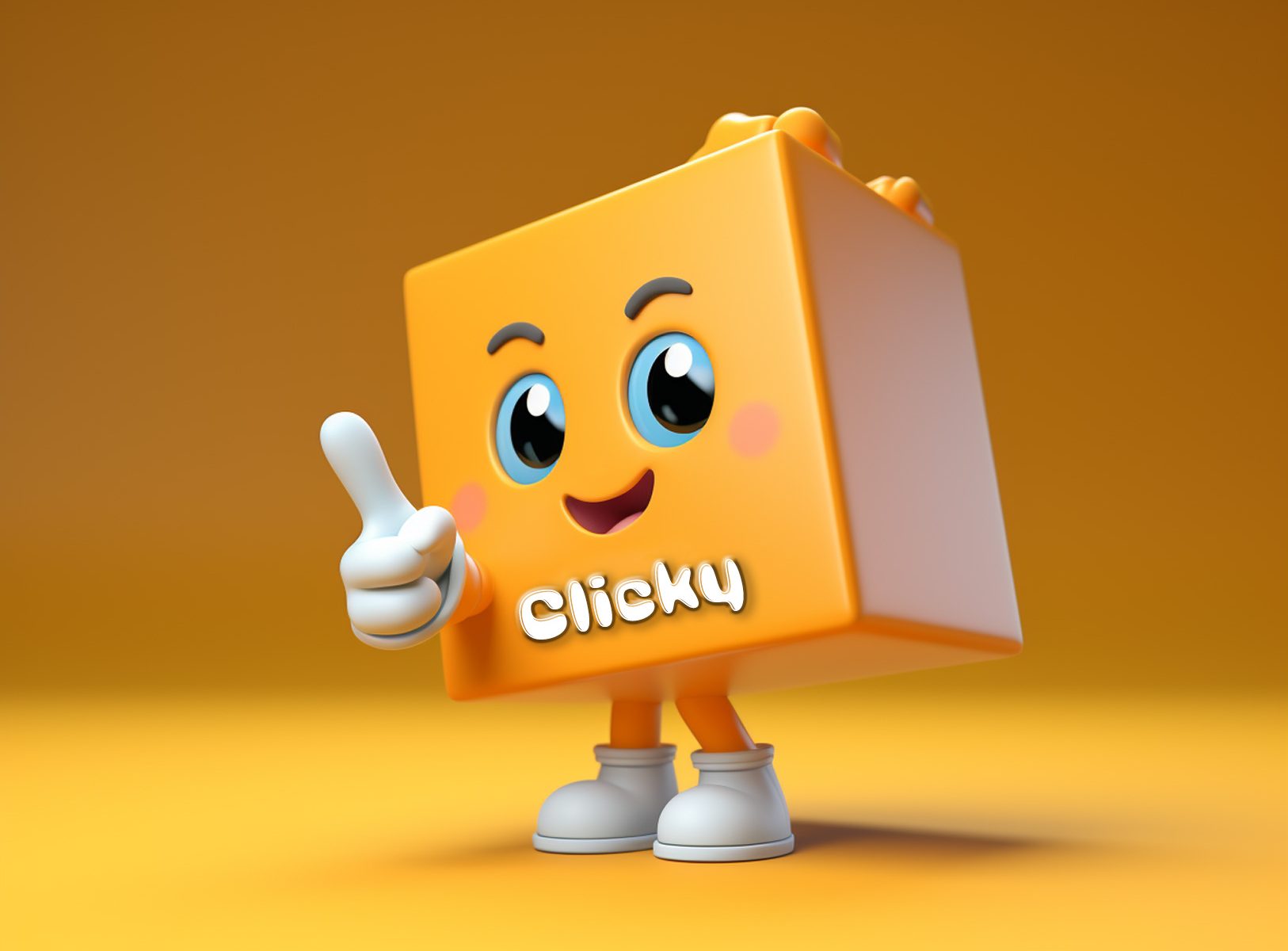
a comical yellow square character with a cursor pointer for a hand and the name Clicky on it.

There is a common element to the content I receive for posting on the web, no matter where I work. When I review first drafts of web pages, I often see the overuse of “click here” or “here” as link text. The use of “click here” as link text is a common practice that has persisted since the birth of the world wide web for several reasons, despite its lack of accessibility and usability. Here are some possible reasons why it continues to be used:

  • Tradition and familiarity: “Click here” has been used for a long time and has become ingrained in people’s habits. It’s a default choice for many content creators who may not have considered the importance of descriptive link text.
  • Lack of awareness: Some content creators may not be aware of the impact of link text on accessibility and usability. They may not realize that using descriptive link text helps users understand the purpose and destination of the link without relying on surrounding context.
  • Convenience: Using “click here” may be seen as a quick and easy way to indicate a clickable link without putting much thought into crafting descriptive link text. It requires less effort compared to writing specific and meaningful link descriptions.
  • Incomplete understanding of accessibility guidelines: While accessibility guidelines such as the Web Content Accessibility Guidelines (WCAG) recommend using descriptive link text, not everyone is familiar with these guidelines or may not prioritize them in their content creation process.

How to Improve

To promote change, it’s important to raise awareness about the importance of descriptive link text in improving accessibility and user experience. Providing education, training, and resources on web accessibility can help content creators make more informed decisions and encourage the use of clear and meaningful link text.

And I’d like to provide that training to content creators. I think it would be a breath of fresh air to lead a training aimed specifically at website owners who are content creators, not necessarily the back-end website coders or pros.

Did you know that when someone who is blind accesses the internet using a screen reading assistive technology, they have the ability to pull all links out of context and have the link text announced. That is their way of scanning the page.

An Example

Improper: “For more information about our accessibility services, [click here].”

Now, let’s rewrite the sentence with descriptive link text:

Proper: “Explore more about our [accessibility services] to ensure an inclusive experience for all users.”

In the rewritten sentence, we replaced “click here” with a descriptive link text that clearly conveys the purpose of the link. This allows users to understand the context and destination of the link without relying solely on the surrounding text. Descriptive link text is not only more accessible for users with disabilities but also improves the overall user experience for all website visitors.